Eventbrite Platform (Documentation)
Designed the experience for developers to easily create API keys and understand Eventbrite documentation.
The big challenge
Eventbrite wanted to ensure that documentation explaining how to best use the code and API were catered correctly to developers. Developer first products like Stripe, Twilio and Mapbox put a lot of focus on the marketing of their respective products. By positioning Eventbrite's Platform with the same standards we gain more trust with our users.
Creating shared understanding of this project was needed and achieved through a 5-day design sprint. To fully dive into this project, all members of the team joined in to provide expertise in the area.
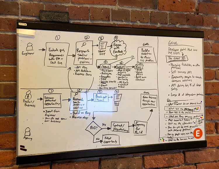
Journey mapping exercise
Understanding the users: developers
Developers’ needs vary based on the product that they’re working on and what needs they have. In the event space, we understood from Nathan Tinius, our developer relations and CX expert, that most requests were about using the API and managing API keys.
From this knowledge, I conducted a competitor/peer analysis of the industry of technology and looked into a wide range of ways to display information and documentation. From my previous work on Adyen’s documentation platform, I had already been familiar with key aspects of great documentations.
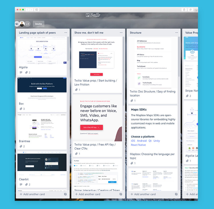
Trello board: market research
Showing more value
As a focus area, we decided that we wanted to show our developers why it was important to use our platform for building APIs. There were pain points from our audit of our existing platform such as lack of value, industry trust, being more human, tracking performance, and the lack of community.
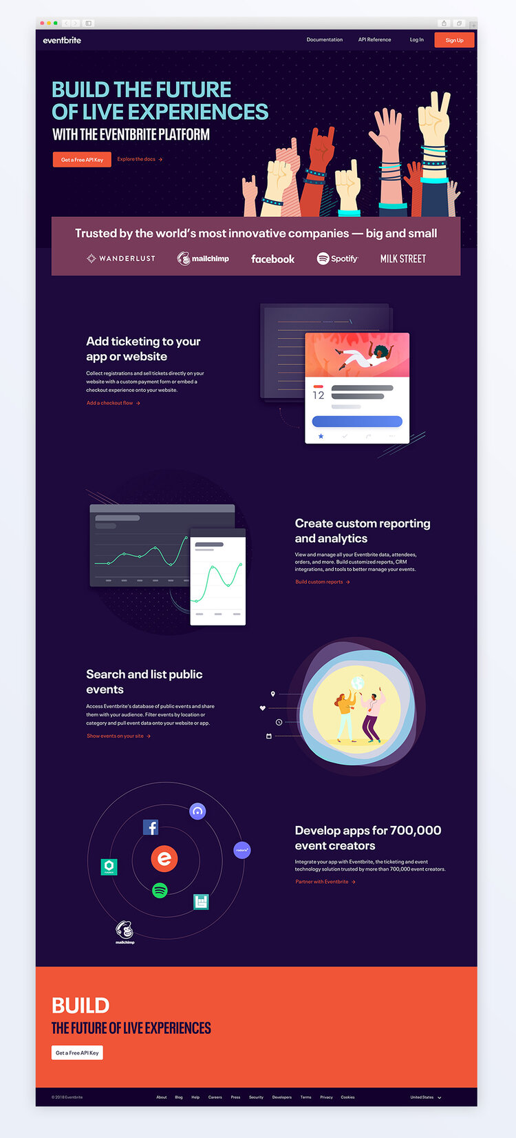
Through our sketching phase, nearly everyone sketched and/or voted on building trust. The solution to show trust in the industry was to show all the 3rd party partner’s logos on our perspective landing page.
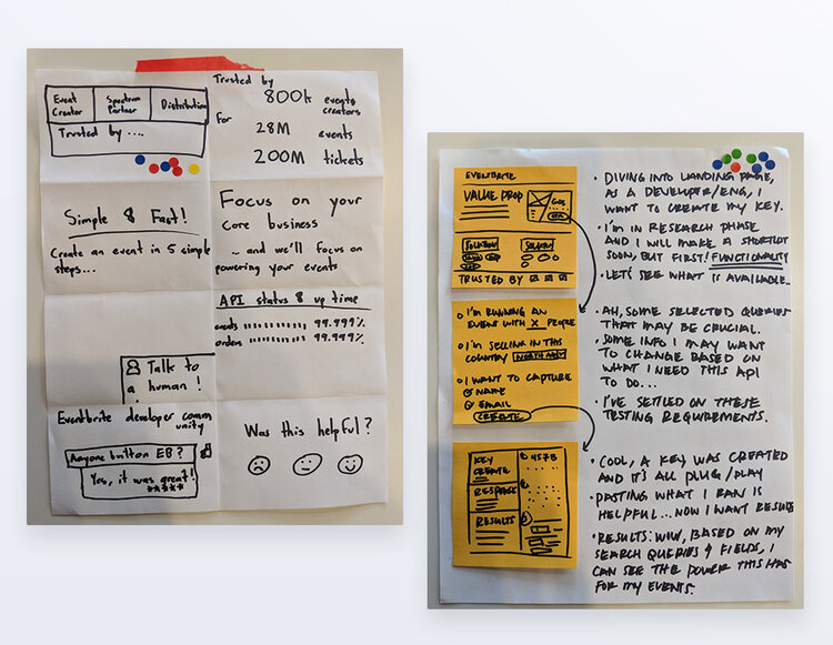
The designs for user testing
From ideation and sketches to designing the prototype for user testing, we had to keep a few things in mind. We needed to use the design system we had and existing blogs and articles to build credibility through content. The main questions we wanted to answer for this design were:
- How might we gauge the interest of a developer through a specifically catered landing page?
- What information is relevant and required to show developers that we care about what they want to achieve?
- How might we improve our documentation showing raw API and improve interactions and potentially have a playground?
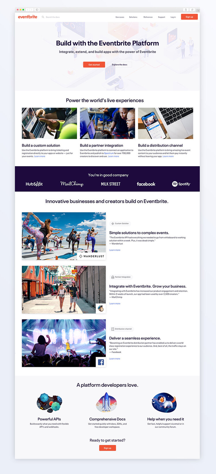
The landing page design used for testing
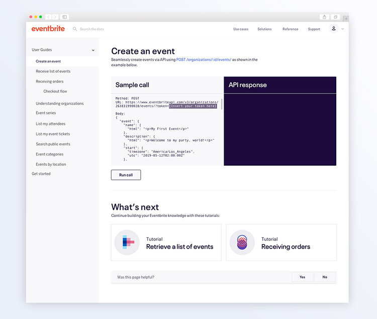
The documentation site design used for testing
Testing and iterating
From testing with prospects to the platform ranging from developers, account managers and director of products, we wanted real data on what they thought about the page and if it sold them to use Eventbrite for their event solution.
Valuable feedback helped create opportunities we had missed — such as creating easily digestible content and creating visuals that would be perceived as less “marketingy” and generic. The CTAs on the page weren’t also clear with the copy “Get Started” because our audience wanted to jump right into creating an API key.
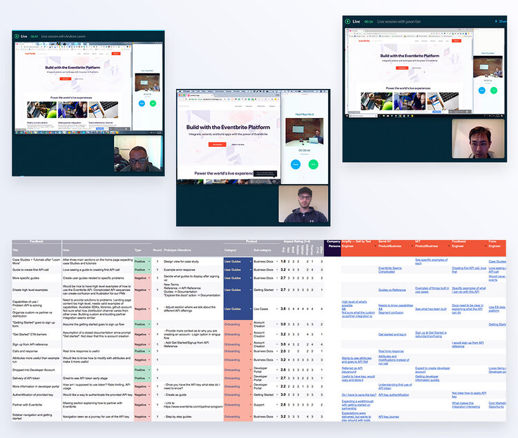
Visual explorations
Since one of the main points of feedback was that it didn’t feel developer focused enough, I decided to run my own exercises to find a solution. Here’s what I did to create the best landing page:
- Sketch out a fluid flow for a landing page
- Develop concepts per section
- Map goals to illustrations
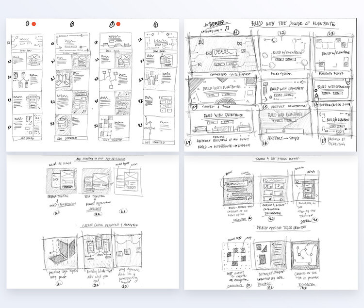
It's always great to explore all options before setting in a solution
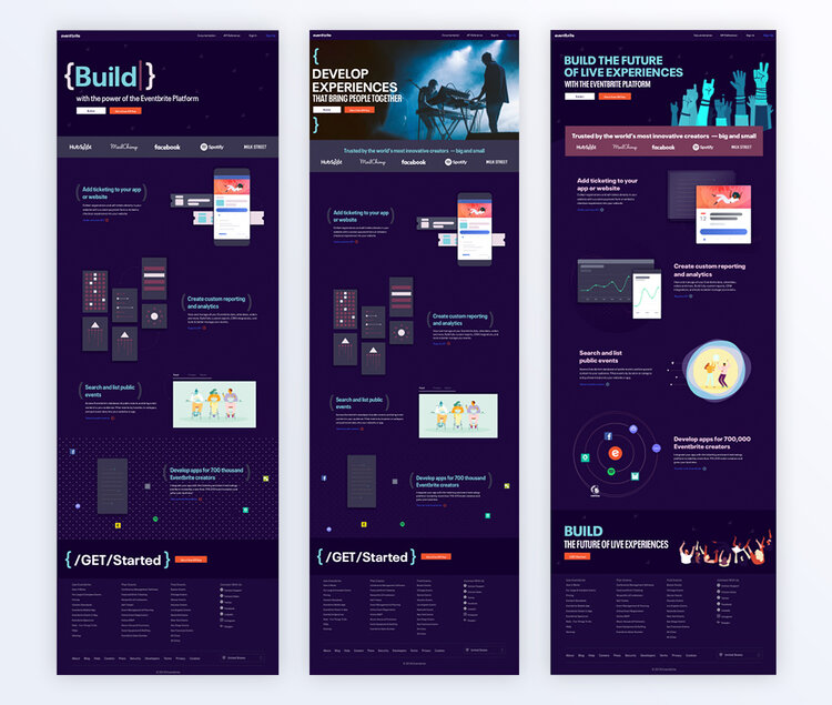
Top 3 layouts
The launched design
Using my traditional process of finding the right solution, I created multiple solutions and worked with our brand designer on the project Ornella Tuco and product manager to find the optimal solution to ensure the use of branding. The product marketing manager and I worked closely on copy and found ways to create compelling content. The scroll animations were fun details to keep developers scrolling down, showing how fun out platform is.
To explore the experience, please visit the Eventbrite Platform and sign up for an account to get an API key!
Conclusion and next steps
I would have loved to see data that we would measure against. The main goal here was to create more API keys, but having a more robust set of actions to track would ensure that we control the whole flow and can iterate on parts of the solution.
Overall, I’m very satisfied with the project’s outcome, but I think we could have measured success better in relation to the core user need.

Passion Projects
© mattchudesign 2024