Adyen Webshop
Adyen wants to help prospect product managers and developers understand how the platform’s server communicates during a payment transaction.
Goals and challenges
The goal was to increase interest with developers and PMs by showcasing Adyen's integrations. Develop an experience that will educate and drive interest on payment integrations that Adyen offers. This would build trust, transparency, and expertise from Adyen to current merchants and prospects.
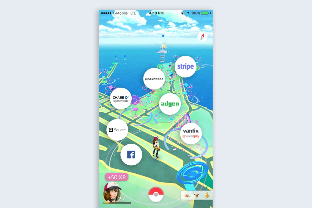
Positioning Adyen as an industry leader of fintech as well as being a unicorn within the Silicon Valley among the giants was a challenge since Adyen was based in the Netherlands.
Measuring success
Measuring success on this project would be on the current prospects that have interest in Adyen that are in the sign-up or contract phase but not finalized. The conversion to finalize and choose Adyen would be measured.
Lightning demo
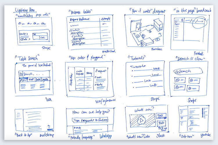
To be positioned as an industry leader in fintech, we have to analyze the space and figure out how these companies stand out, feature-wise. Some of these companies include Stripe, MasterCard, Visa, Mailchimp, Whatsapp, Slack, YouTube and Facebook.
Solution sketches
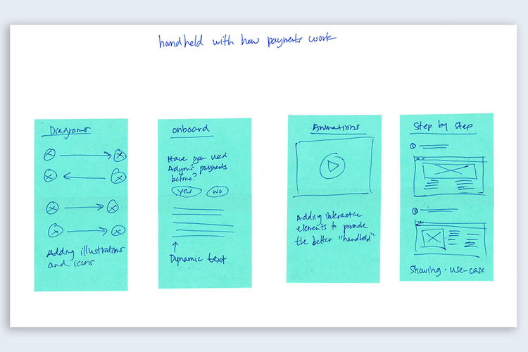
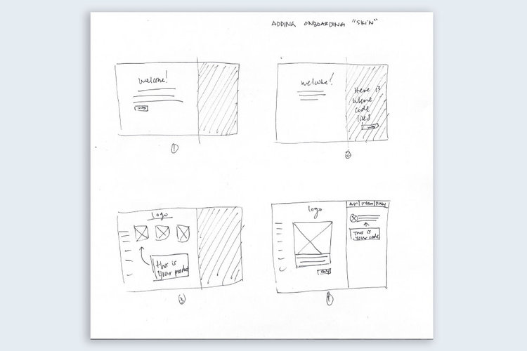
After interviewing current merchants and gathering data from the sales team on prospects, we found that many people wanted to be “handheld with how payments work” and this fueled the keyword onboard.
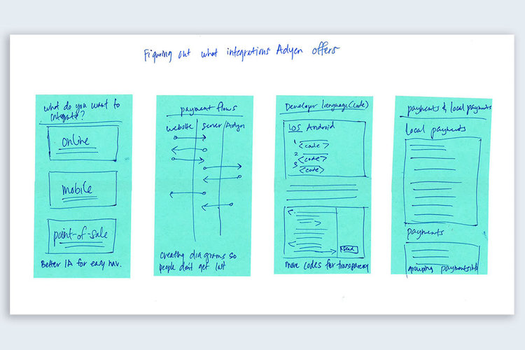
Adyen offers a few integrations: online, mobile, and point-of-sale. Those that seek a payment processor typically do not know that we offer different integrations such as these and the requirements such as hardware and software. For developers, many ask which languages are available.
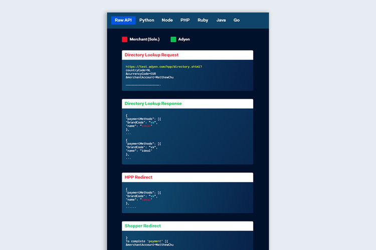
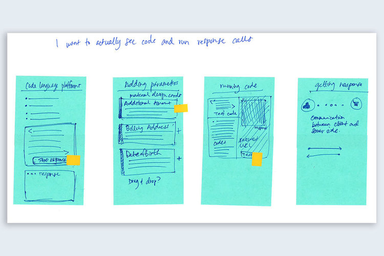
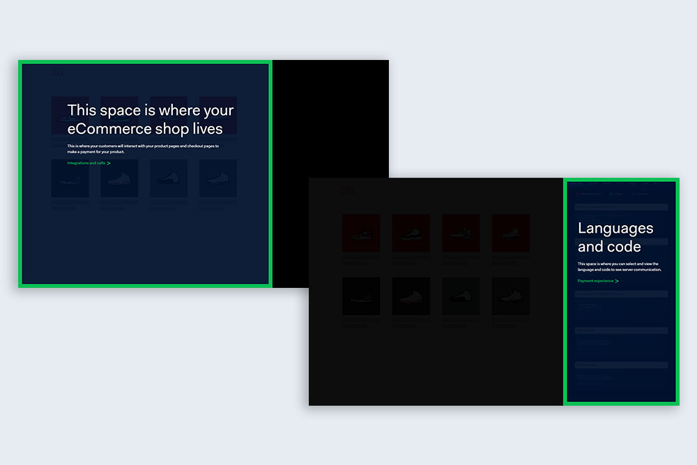
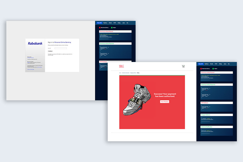
For developers, code is important. Codes and responses is a big part of the solution as the target market of developers really need to see how the code and functionality works.
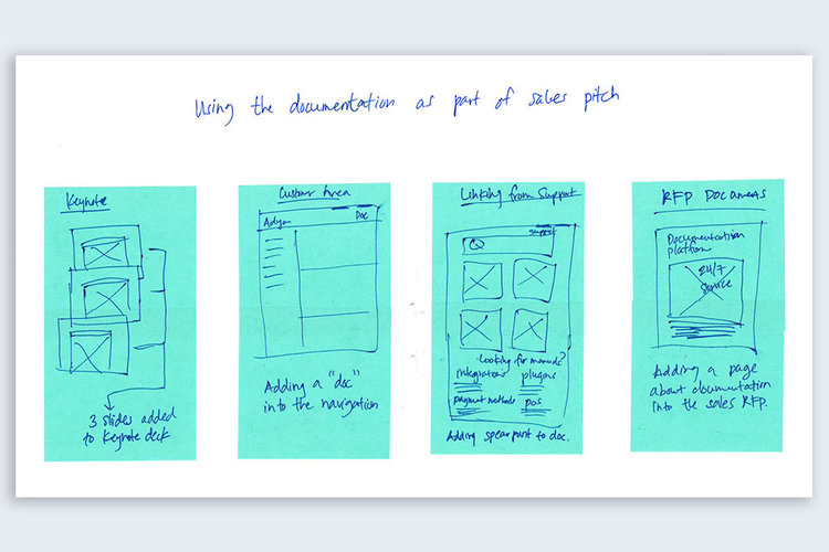
For marketing and sales pitches, this project cold be a gateway to discussing about payments partnership. From RFP documents to customized keynotes, this product would be able to boost interest and engagement.
Onboarding research
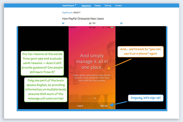
The teardowns on useronboard.com uncovered many insights such as removing friction, barriers, and more. This was a good learning experience that assisted in the whole project on “handholding” users from the very beginning until the end.
Wireframes
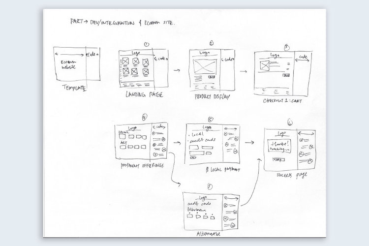
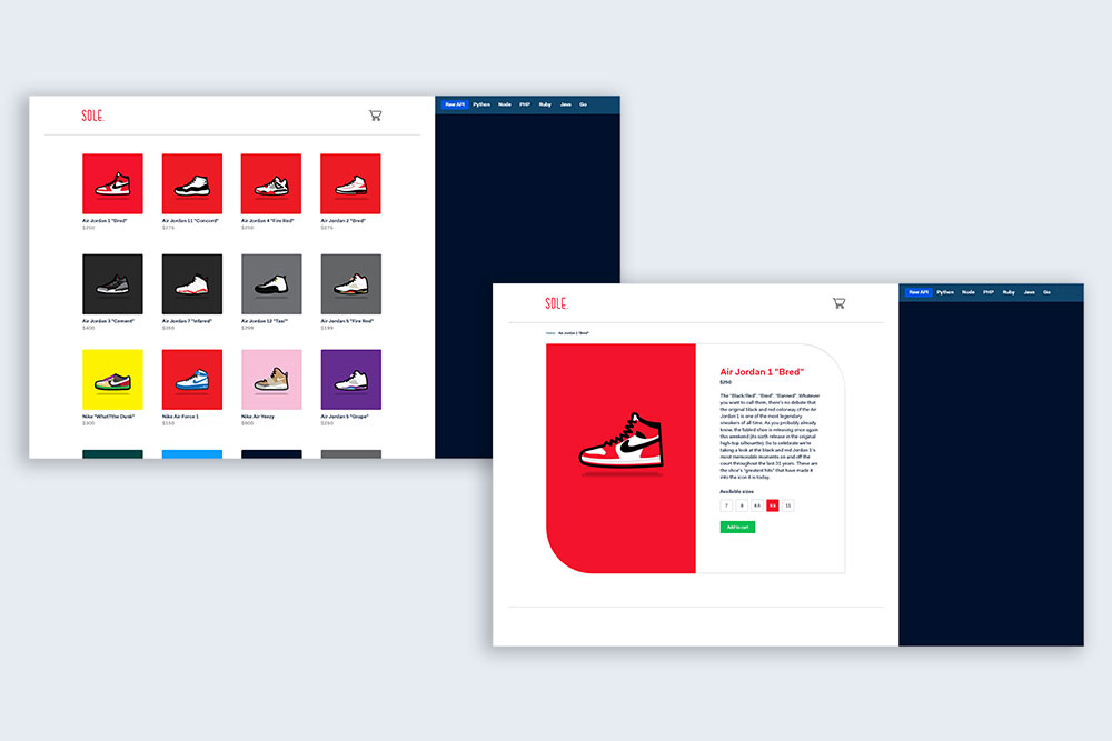
The wireframes here were created to mimic a checkout experience along with server communications on the right. With these sketches, I was able to work with our developer to figure out how to best display this. The use of iframes would be the best solution to make this quick and easy to deliver.
Early sketches
In midst of this project, Adyen went through a major branding transformation and this is one of the earlier designs. The visual design overall roamed in areas of greys, dull colors, and felt very robotic due to its very techy font like Titillium, paired with Open Sans.

Final design
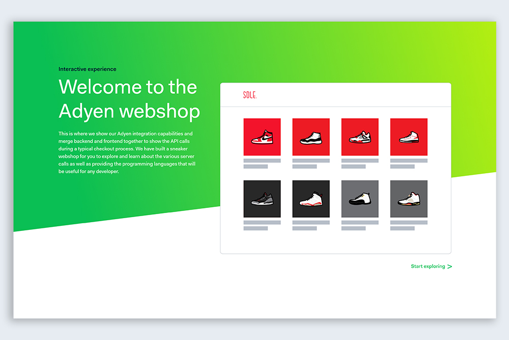
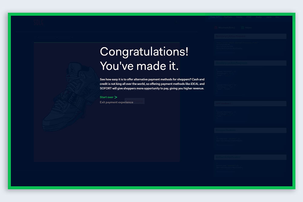
After two weeks of a design sprint on the rebranding of Adyen, the design team and I finalized on creating more modern colors for the brand. A new typeface was introduced, Fakt, and more variations of font sizes were finalized. Bolder greens and even a hint of blue in the "Adyen black" makes the design much more compelling.
Want to check out the prototype? Click here
Conclusion
Feedback: The core learnings were usability-based and learning what the best practices were when it came to onboarding. We can make stronger design decisions when we under the wants and needs from the people we design for.
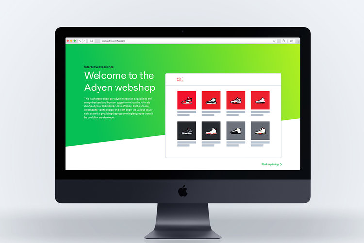
Takeaway: The webshop assists people that are new with payments by having an onboarding experience. For developers, this tool can be useful to show how API calls are made during a transaction. By having this available during sales meetings with prospects, Adyen will be seen as an industry leader as well as a company that vouches for great user service.
Passion Projects
© mattchudesign 2024