Eventbrite App Marketplace
Designed an ecosystem that houses plugins for Eventbrite creators to utilize to improve efficiency within the lifecycle of running their events.
The big challenge
Apps grow Eventbrite exponentially and offer creators a complete solution for their events to reach success. There’s been year over year charts that proved this. Most creators were using 3 apps through Eventbrite and weren’t even aware. A creator’s events have special needs (format, category, frequency, size, geography). The goal was to increase awareness and adoption of apps. We wanted to launch a refreshed Eventbrite App Store that is trusted by creators and partners. The research found was that our cluttered Spectrum, the old app store, felt “wonky” and “messy” which gave event creators the impression that it was unreliable and time consuming to configure.
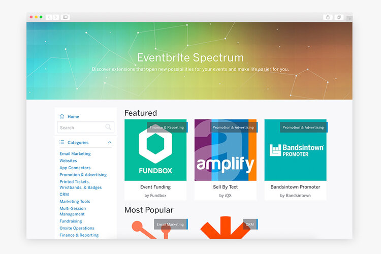
Spectrum, before the rebrand into The Eventbrite App Marketplace
Why this matters
In March 2018, we surveyed over 37,000 Eventbrite creators who were using apps about their experience with apps. 72% weren’t aware they were using an app at all. Their main worry was that it may ruin their events instead of enhancing it. The sales team and customer experience team weren’t aware of impact apps have on events. Additionally, partners that developed these apps have let the apps go stale. Creators mentioned that they didn’t have the time to explore features or third-party apps though they agreed that apps are important to success.
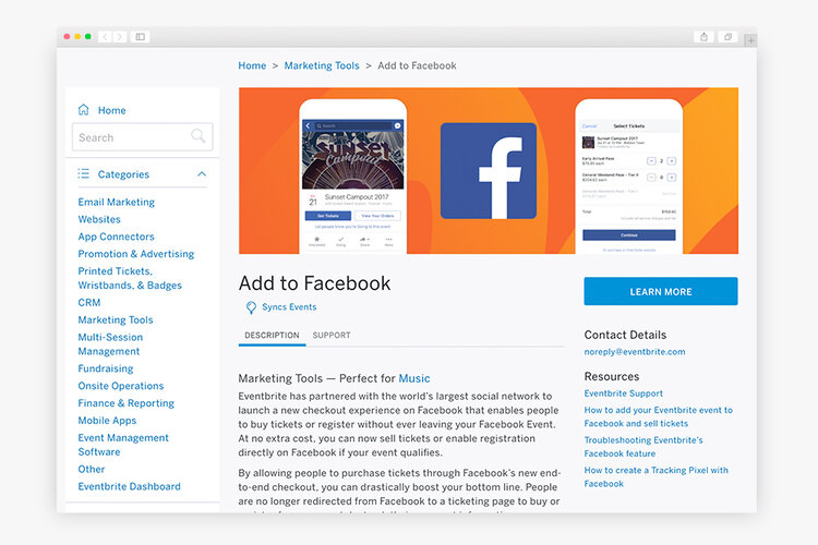
An app page on Spectrum, showing offering of an app’s functionalities and offerings
Design sprint
Bringing the team together for a design sprint with the team to build shared understanding of the problem space was my priority. Prior to the design sprint, I had prepped a few research areas together: conduct competitive analysis and analyze areas of opportunity in my Trello board (I love using Trello to document a project’s progress!).
Agenda for the design sprint
Day 1: Ideate, shared understanding
Day 2: Journey mapping, sketch, assumptions, key questions
Day 3: Decide, revisit key questions, storyboard
Day 4: Prototype and design
Day 5: User testing and validating
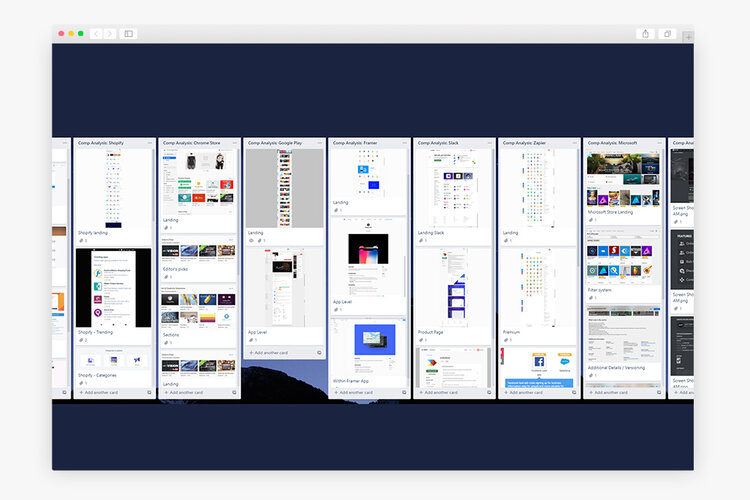
My Trello process
Ideation, sketching, building assumptions
To really understand the journey of creators using apps, we surveyed them and interviewed them. The logical next step was to figure out how we could create a new portal of apps for them. This meant thinking about how apps could naturally be included in the event creation and hosting process.
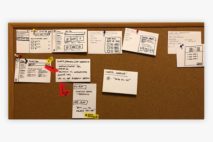
User journey pinned on a nice cork board
Prototype designs
After putting together the sketches and journey mapping, the next step would be to go digital and map the user problems to a solution they can use, or at the very least, provide feedback on. The main goal here was to gather as much feedback as possible to figure out what the explicit signals were for creators to be interested in using apps and what they expect from them.
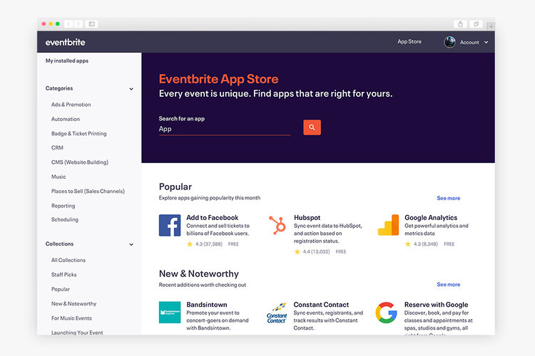
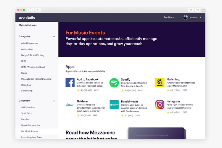
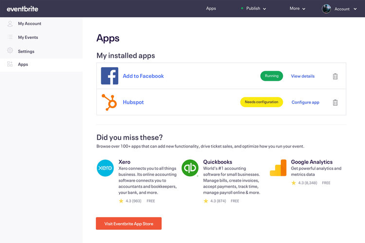
Feedback from users
When we tested the prototype, we found a lot of areas of improvement — and that’s a great thing. This means that creators are passionate enough to tell us what they want. There can be feedback where there aren’t any ideas to follow up on in general in user testing, so that’s why having the right set of questions to guide feedback and feelings into a composite is important.
The team and I then measured and voted on the areas we would like to tackle and provide creators with the most value. This then would become our MVP as long as it mapped to the original OKR and business goal.
For example, the left navigational menu felt more like in-product instead of a separate portal, which users wanted. This piece of feedback that was mentioned multiple times gave us the feedback we needed to portal where we bring excitement of brand and product together for apps.
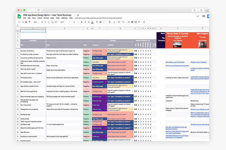
Feedback from user testing
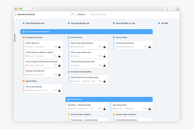
Prioritizing opportunities
Iterations and going live
Based on the feedback loop we received from event creators, we successfully launched The Eventbrite App Marketplace. Throughout the process, we always kept the creators/users in mind. Collaboration was key in this project, so I branched out to different teams such as customer support, brand design for illustrations, sales, and product managers to ensure that we had their support for the changes and got their feedback as well.
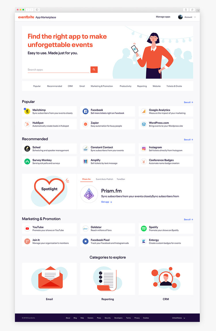
Launched home page
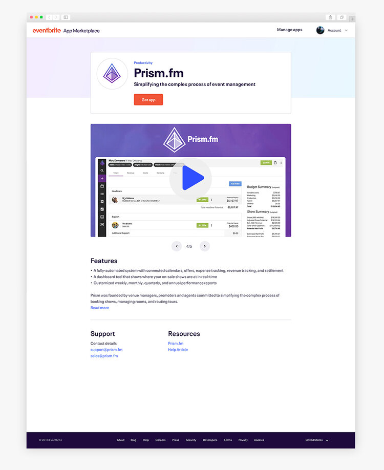
The app product page design for Prism.fm. All apps have their dedicated product page
Conclusion and next steps
There will always be design trade offs and it’s important to build the baseline MVP before aiming for top features that provide a better experience like reviews and ratings (which has launched shortly after). There were problems with our platform’s navigation and architecture and what I would have liked to do is improve that experience to improve discoverability instead of revamping a product.
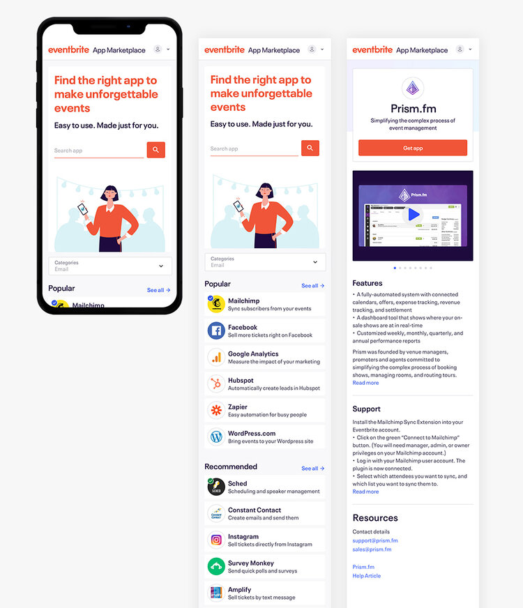
Passion Projects
© mattchudesign 2024